Showing posts with label $Front. Show all posts

Monday, August 13, 2012

Don't Let Android Fragmentation Get You Down

If you have decided to build an Android app the task of deciding which OS version to support and which devices to support can be daunting.  Here are some tips to help you sort through the sea of variables that exist and help you focus on what really matters.

Understand OS Adoption Rates:
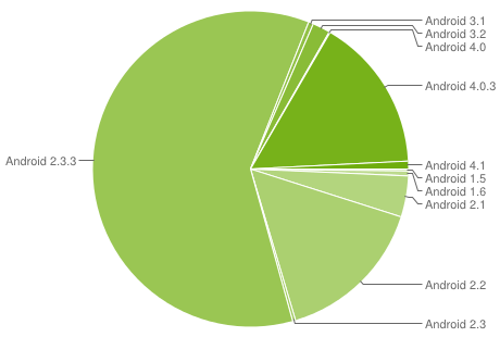
First, check the stats for Android OS adoption. There is a great Android dashboard that gives the top OS version hitting the Google play store for that 14-day period.   At the time of this blog, the Gingerbread 2.3.3 version has a little over 60% of the Android market share.


Understand the Device Market:
A recent study done by OpenSignalMaps did a great job of visualizing the Android device market fragmentation.  This information can quickly help narrow the devices to tailor your development and testing efforts.
Samsung and HTC are big players but the market share division gets ugly quickly.


Unfortunately, knowing the device maker is only half the battle.  The models and features of each model can vary greatly.  Getting down to the model level will help further refine your efforts.


Get the Right Testing Tools:
Purchasing physical devices to physically test your app on is ideal. But it gets costly and can be difficult to scale. To get breadth of testing, consider enlisting the support of testing tools and services such as DeviceAnywhere or Perfecto Mobile.  These services offer enterprise scale access to thousands of devices and OS versions.  This affords the ability to quickly test out how a feature performs and trouble shoot specific user issues. 

Capture App User Feedback:
The app store ratings is not where you want to first surface any issues with your app. To keep negative user reviews at bay, consider adding an in-app feedback mechanism.  This provides your users the opportunity to give candid feedback during the in-app experience and keeps the negative reviews out of the public eye.  Tools like OpinonLab give the customer a voice and help feed your product backlog as well as identify trends across user experience. 

Reassess Everything Quarterly:
As with anything in the mobile space, things change quickly.  Use the tools and information out there to  reassess where the Android market is and where you should be focused.


What are the strategies your company is using to keep pace with the demands of the Android market?

Friday, April 6, 2012

Why Your Business Needs a Mobile Website


While we anecdotally know that people are using smartphones more than ever these days there is real data that supports it. Studies have predicted that by 2014, more people will use mobile phones than PCs to get online.  If your business is just starting to develop a mobile strategy or if you are debating where to spend resources in your current strategy, here are some compelling reasons to continue to invest in the mobile web.


People search on mobile web, not in the app store.


We don't go to the app store looking for information.  We go there to find something specific- a game, a productivity tool, a mobile version of a service we are already using offline or in the desktop world.  We go to our browsers to do research and gather information. That coupled with our new behaviors means that people are more likely to be looking for your products and services on a mobile browser. 


If you have a mobile website, your site search feature should be considered one of the most if not THE most important feature.  It must be fast, contextual, and simple to use. Here are some interesting stats from a 2011mobile search study:
  • People used mobile search at home in the evening (81%) than any other time or places more frequently than anywhere else (81%), followed by at home on weekends (80%).
  • 66% use mobile search while while watching TV, something which should get advertisers thinking, while 61% said they use it at work.
  • 75% said mobile search makes their lives easier, 63% said access to mobile search has changed the way they gather information, and 32% said they use mobile search more than search engines on their computers. 
  • 84% use mobile search to look for information on local retailers, such as opening hours, address and contact details. 82% look for online retailers, 73% find a specific product or manufacturer website. 
  • Something which ties in with the crossover in TV viewing and mobile search is that 71% learn more about a product or service having seen an ad, 68% use it to find the best price for a product.

Consumer behaviors
 have changed.
We are always on our phones.  When we have downtime, when we are in the middle of another activity, first thing in the morning, last thing before we fall asleep. With 66% of people using their smartphones while watching TV coupled with the results from an Internet Retailer study about what people are buying from their mobile devices (see below),  you could have some pretty compelling conversion rates between TV advertising and purchases.
 
A recent survey of 1,500 US adults at the 2011 Internet Retailer Conference Exhibition revealed mobile shoppers’ most common purchases broken down by percentage:

•   16% bought apparel
•   15% bought food and beverages
•   11% bought toys and games
•   8% bought home goods
•   4% bought sporting goods
•   3% bought jewelry
•   8% bought all other product

Our fancy phones have also made us lazy.  We are more likely to make a purchase using the device already in our pocket than taking the effort involved to go to and boot up our desktop computer.  I can honestly say that I've made more mobile purchases in the last 6 months than from my desktop computer.  My drivers for mobile purchases are time & convenience.  With a 3 yr. old, a newborn, and a full-time career, the best time for me to shop is whenever I can steal a few minutes during my busy day - waiting in line, my train commute, in bed...


If you don't have a mobile site, or if your site is less than desirable, you will probably loose a potential customer.


People are going to try to find you via a mobile browser whether or not you are ready to be found. If you haven't put a mobile web version of your site out there yet, your desktop site will be rendered.  While chances are the site will load (if your site is flash based, forget reaching the millions of worldwide iPhone users) the user experience will suffer.  The mobile screen dimensions will require a lot of pinching and zooming to make the basic functions of your site useable.  Statistics show that a potential customer is more likely to seek out competitor with a mobile site than suffer through a poor mobile experience.  

Similarly, if your existing mobile website is difficult to use and slow, people will abandon it. Don't forget the best practices of mobile design - keep it simple and task oriented, design navigation for the thumb, keep the code lightweight and fast, use all the available phone senses (i.e. GPS, the camera) to make search fast and rewarding.

What are some mobile websites that you frequently use?  

Tuesday, July 5, 2011

Good Thing Gone Bad: How to Tame Google Doc Sprawl

The Google platform is a fantastic and basically free option to use as a collaboration and productivity tool within a business. My company uses it. It's been key in enabling the flow of ideas, the sharing and storage of information, and collaboration. But, our mantra of "just throw it in google doc" is now becoming a tangled web of one-off information and difficult to find resources.

The first step to taming the beast is recognizing that this will happen. With so much freedom to spin up and share information it can quickly get out of hand. What good is a doc or spreadsheet if no one can find it? Here are two ways to get and keep your info organized:

Consolidate documents through a Google Site
At an enterprise level use the Google Sites feature to logically organize information and create a portal. Google Sites is an entire topic in and of it's own, but you can very quickly build a site that can simply serve as the launch pad for all of your information. The site ties all the random docs together and can be organized in a way that makes sense for your organization. We use a site as the foundation for our company intranet. The information architecture is organized by department. All the relevant google docs for a department are categorized as links within the portal. This has been a handy reference tool particularly in the on-boarding of new employees. We also leave the site permissions open so that anyone can add more links to docs. We've virtually eliminated the need for sophisticated system administration and content management. Although lightweight governance over the site is recommended so that we don't end up with another problem - a disjointed information architecture

Leverage Personalization Capabilities
At the individual level, you can create folders and labels to logically organize documents in a way that makes sense to you. This feature is called Collections. The google documents view allows each person to create their own filing system structure for finding docs. This personalized approach to managing info is more powerful than it may seem on the surface. Think about it, in traditional environment someone else manages the directory structure and naming convention of a shared drive or LAN. They've already decided how information should be organized in terms that make sense to them. We've got a company shared drive too for docs that are required to be static. And guess what, the biggest complaint is that people cant find what they are looking for. This nuisance actually creates a bigger issue when people take things into their own hands and start storing their own versions of documents locally or wasting time trying to find then emailing documents around to each other. Organizing our google docs in my own terms changed my world. While it's simple enough to just do a search to find the right document, categorizing docs keeps all related items together and let's you quickly locate information related together but kept in separate documents.

How are you using the google platform for your business? If you want to more about how to strategically use the Google platform, contact me.

Thursday, January 20, 2011

Decoding Apple's Human Interface Guidelines Part 2: Designing Great Apps

The User Experience guidelines are probably the most crucial "rules" in Apple's suite of Human Interface Guidelines. These provide the insight and advice you'd typically pay a pricey design firm for. By understanding and embracing the User Experience guidelines you'll know how to not only use the mobile medium most effectively but also create mobile apps that people genuinely enjoy interacting with. Creating a delightful user experience leads to word-of-mouth exposure that no amount of marketing dollars can secure.

There are 26 guidelines that Apple recommends following. I've broken them down and consolidated them into what I call the "The 6 Commandments of iPhone Design".

1. Have a clear focus

Unlike the desktop browser world, the mobile world is task driven. The mobile context means that your users are likely multi-tasking and are looking to an app when they have a few minutes to spare to and want to accomplish something very specific. Your app needs to have a clear purpose and emphasize the most current content/information. Given the screen real-estate constraints it's important to approach app design by asking:

What's needed right now? - based on the purpose of your app, the most relevant and timely information should be the most prominent. i.e. Breaking News, current weather conditions

Is this needed at all? - the most difficult decision is not what you include but what you don't include in your app. It's more important to create an app that helps the use achieve one primary goal really well than be functionality rich.

2. Make it work like I think it should

Your app should be intuitive. If it requires help text or instructions to use, it's time to go back to the drawing board. The main function of the app should be obvious. A great example is the native stop watch or compass app that comes with the iPhone. It's pretty clear by looking at the app what it does and how to work it. The physicality aspect of the compass helps make it intuitive. It looks like a compass, you physically turn your phone like you would an actual compass to get a reading. It's simple and intuitive. And the graphics are fantastic to look at.

3. It's not about you

Along the lines of creating user-centric apps, don't crowd the already precious real-estate with your logos or anything not relevant to the user achieving a goal. Your marketing and branding opportunity comes with designing your app launch icon and in crafting an effective app store description.

4. Make it seamless

Apps that are mobile variations to a wired web browser based parent should have seamless connection with the data available. Don't require a cumbersome app set up process, leverage what you already know to create a ready to use app moments after app store download. In today's social media world, people like to share for better and worse. Encourage collaboration and make it easy for users to tell their friends about your app and share content.

5. I want to find, I don't want to browse

The mobile context is all about relevant information ready before I know I need it. The search capabilities should be tailored to fast and rewarding searches. Display partial results quickly and use on-screen controls to help users quickly filter through results sets. There are out of the box user interface elements called scope bars that can help with limiting the data that an app pulls back. Tap into the phone senses such as the GPS to order results by those "closest" to where the user is now. And keep the search box near the top or header of the app where users expect it to be.

6. Entertain me

Creating a truly enjoyable experience relies on not only a focused, user-centric purpose but also stunning graphics and the use of physicality and realism. Enhancing a user's sense of direct manipulation such as turning pages or physically rotating a phone to engage the compass creates apps that are delightful to use. They can make performing the simplest of tasks a truly memorable experience. And help create the buzz that you are looking for.

There you have it. 6 golden rules for designing iPhone apps that will have your users coming back for more and spreading the good word about your app. Read the Part 1 of my blog series on Decoding Apple's Human Interface Guidelines here.

Use the comments below to tell me more about the apps you love and which apps keep you coming back for more.
Tuesday, December 14, 2010

Decoding Apple's Human Interface Guidelines: Part 1

So, you are ready to build an iPhone an app. The good news is that a lot of the decisions are already made for you in terms of how things should look and work navigationally. The bad news is, there are a lot of guidelines (rules) to follow to make sure your app gets through Apple's App Store review process. Apple has a set of Human Interface Guidelines that, coupled with the the built in features and on-screen controls available out of the box in the SDK, give you what you need to build a solid app. These are more than just guidelines but rather explain the method and rationale behind design best practices and maximizing the end-user experience on the iOS platform. Through the Human Interface Guidelines Apple is expecting iPhone app designers and developers to reinforce and embed the consistency people expect when using an Apple product. If you plan on creating an iPhone app for mass consumer consumption, these guidelines are a must to follow.

This is the first of a 3 blog series where I'll dive into the components of the Human Interface Guidelines. This post focuses on three of the seven guidelines:


  • Platform Characteristics

  • Human Interface Principles

  • Application Design Strategies

Platform Characteristics
Embrace the iOS as a platform. This means embracing the way people expect to interact with with the iOS platform and the "gestures" the go along with navigating and executing tasks. Gestures such as the pinch and zoom, making changes to device orientation (horizontal to vertical), tapping vs. clicking. Other platform considerations such as where users expect to set one-time app preferences ( via the native settings app, not within an app itself) is important to note when designing your own app. Did you know that the comfortable amount space to allow for a "tap zone" is 44x44 pixels? Apple figured this out and accounted for the fat finger. Allowing a tap zone 44x44 pixels avoids the issue of having elements too close and creating end-user mis-taps.

Human Interface Principles
The Human Interface Principles revolve around designing an app that behaves intuitively. It should be designed with aesthetic integrity. Meaning it looks the way it functions. Have a clear single purpose for your app and make sure it looks the way one would expect to complete that task. Help people transfer knowledge by providing consistent use of common controls and on-screen elements. If they already know what a control or icon means, then they expect it to behave a certain way when they see it again. The iOS platform allows for direct interaction with on-screen controls. Allowing people to directly interact with controls on-screen as they would in their native form helps people already know how to use your app. A great example is the iPod app. The on-screen controls for playing, fast forward, and rewind, look the same as they do in their native format on the stand-alone iPod device. This means users who already know how to use an iPod, know how to interact with the on-screen controls translated to the iPhone app version. Another great example is the Compass app. It looks and behaves just like a "real" compass when you change the orientation of your iPhone device. No instructions needed because you are able to translate your knowledge of how a compass works to the compass app.

Application Design Strategies
The Application Design Strategies guidelines provide a framework for determining what it is that you want your app to do. First and foremost it's important to have a clear statement of purpose for your app. What goal(s) does it help the user achieve? And along the lines of purpose - don't attempt to do too much with your app. The best apps do one thing really well. The worst apps try to do/offer too much. To narrow what it is that your app should focus on it's important to know who your audience is. And not just general segmentation by demographics, really dig into who it is that your targetting and the common characteristics of those people. Pick 2 or 3 characteristics to tailor your app to. Then filter the features of your app tailored to those audience characteristics. Now your getting to filling a need for a very specific audience and designing the interaction in a way that delights your target. With design discipline and diligent focus you have the recipe for creating an app that is "sticky" and gains faithful followers who evangelize the app. Evangelizing = more downloads = $$$$.

Next up, Part 2: User Experience Guidelines and Element Usage Guidelines.

Monday, November 15, 2010

m-Learning: The Next Evolution in Enterprise Training

"As the bell rings, the teacher reminds students that Podcasts of the lecture are available for download, and queries that come up during study review can be messaged to her number. "

Sound familiar? If you have school age children - K through college - you are probably getting well acquainted with the new way of learning. Teaching is no longer tied to the walls of the classroom or what's on the blackboard. This is more than just e-Learning. While the concept of e-Learning was a technological advance in the way teaching is done, it is still about being tethered to a computer. m-Learning is about on-demand content delivery anywhere.

Wikipedia defines m-learning as - Any sort of learning that happens when the learner is not at a fixed, predetermined location, or learning that happens when the learner takes advantage of the learning opportunities offered by mobile technologies. In other words, mobile learning decreases limitation of learning location with the mobility of general portable devices.


This is not just a concept relevant for the classroom. The enterprise should recognize m-learning as a powerful add-on tool to their learning strategy. With corporate culture moving more to toward the concept of the "deskless worker" and smartphones moving up the ranks from the "third screen" to the "primary screen" for end-users, the enterprise should re-think and refresh it's strategy for delivering training material. Here are some considerations and business drivers for taking your enterprise learning strategy mobile:

From Push to Pull Learning

m-Learning affords the benefit of contextual learning. The opportunity to get the learner in the environment they need that content. Making content available in a format and context that is most meaningful to the learner aids in absorbing and reinforcing the material.

Start with Sales Force

Looking for a pilot group to tactically test your m-learning strategy? Start with your sales force. The folks in the sales organization tend to be early technology adopters. These are the people that live outside the office, often on the road, and can be the most disconnected from what's happening inside the walls of the enterprise. They want relevant information when they need it and are sensitive to time. Time they spend training is time they aren't selling. Since individual compensation rides heavily on sales, finding time to train can be a low priority. Mobile affords your sales force with just in time training. And it shifts the perception of training from a "forced necessity" to "valuable information when I need it".

Make Mobile Part of a Blended Learning Approach

Mobile learning makes the most sense when it's part of a larger program. It supports and re-enforces the learning process and offers the learners not only the opportunity to learn both together and apart but also to learn in their optimal environment.

Build Your Business Case: Stats to Consider

Don't just take it from me that mobile is going to be the platform of choice. Industry trends are pointing in that direction already.

Mobile subscriptions are on track to hit 5 Billion worldwide this year. That means more people will have access to data through their mobile device than through TV and PCs combined.

Avoiding the Pitfalls

Deploying an m-learning strategy is as much about the people and technology as it is about the content. This feeds directly into the decisions the enterprise must make around supported mobile devices (smartphones, tablets) and the people required to maintain and build-out capabilities. Technology can be a huge competitive advantage but think before you build. Here are some challenges to address before you deploy:

  • Connectivity, battery life, and bandwidth restrictions - know how your end-users will be connecting and device limitations before you build.
  • Device requirements/restrictions - Screen size, key size, Multiple standards, multiple screen sizes, multiple operating systems. Mobile platform standardization is a precursor to deploying m-learning within the an enterprise.
  • Number of file/assets' formats supported by a specific device - make sure your m-learning development team is aware of the technology requirements and limitations.
  • Content security - don't forget about encryption for any content that will reside on a mobile device. An enterprise mobile policy should address content security requirements/standards.
  • Reworking existing e-Learning materials for mobile platforms can be labor intensive - it's not a copy and paste exercise so plan for it upfront.

Is your company deploying training to mobile devices? Post comments and share your stories.

Monday, August 23, 2010

3 Ways to Start Using the Cloud Today

The cloud is big right now but it's still a difficult transition for many companies to make. Cloud hesitation is mainly related to FUD (fear, uncertainty, and doubt) rather than based in real-life experiences. Small businesses have embraced the cloud and SaaS offerings as a great democratizing offering. Through various cloud based applications, IT infrastructure and storage capabilities, and collaboration and productivity suites, the cloud has afforded the small guys with IT capabilities that would not have been possible on smaller budgets just 10 years ago. This is allowing more innovation, faster product development cycles, and overall more time to focus on the core business and less time worrying about supporting and administering an IT infrastructure or upgrading application capabilities.

Here are a few ways enterprises can start testing the waters to find the right balance between cloud based and traditional IT:
Email

This may sound like a big leap, but along with storage, email is quickly becoming one of the biggest commodity services. With names like Microsoft in the arena, and their hosted Exchange offering, the transition may not be as daunting. These services are cheaper for the provider to run and make a great enterprise business case for migrating more capabilities to cloud provider alternatives.


Collaboration/Idea Generation/Brainstorming

All 3 of these equal innovation. Give employees quicker ways to capture and share ideas. The Google apps platform and Microsoft BPOS are examples. With remote and distributed workforce becoming the norm, these platforms let you quickly co-create and share information. Easier collaboration and co-creation can lead to more innovation faster. A great example is using Google Apps to quickly create a shared spreadsheet to capture ideas that can be shared with remote participants - no conferencing technology or screen sharing technology needed.

Knowledge Management
Let your staff organize and share what they know, what's important, and what they are working on. Sharepoint is a common example but I'm a huge fan of Google Sites. Google Sites provides simple, easy to use, pre-defined templates to get you started. Starting a project? Create a site. I've used Google Sites to manage the execution of projects as well as a repository for final deliverables. These tools provide a quick consistent way to allow staff the self-service capability to make information accessible.


What is your company doing in the cloud? Is it embracing the cloud? As always I welcome your thoughts on the topic. Please share below.